# Datalibrary(MASS)recruitment <-read.csv("data/recruitment.csv", row.names =1)# Transformation of the variable to predict in a factorrecruitment$Res[which(recruitment$Res ==0)] <-"Rejected"recruitment$Res[which(recruitment$Res ==1)] <-"Accepted"recruitment$Res <-factor(recruitment$Res, levels =c("Rejected", "Accepted"), ordered = T)recruitment
Id
Dip
Test
Exp
Res
A
1
5
4
Rejected
B
2
3
3
Rejected
C
1
4
5
Accepted
D
2
3
4
Rejected
E
1
4
4
Rejected
F
4
3
4
Accepted
G
3
4
4
Accepted
H
1
1
5
Rejected
I
3
2
5
Accepted
J
5
4
4
Accepted
Code
library(plotly)fig <-plot_ly(recruitment, x =~Dip, y =~Test, z =~Exp, color =~Res, colors =c("#BF382A", "#0C4B8E"))fig <- fig %>%layout(scene =list(xaxis =list(title ="Diploma"),yaxis =list(title ="Aptitude Test"),zaxis =list(title ="Experience")))fig
Figure 1
1.2 Objectives
First objective: explain the variable RES by the 3 scores obtained by the candidates and obtain a graphical representation that will distinguish the good candidates from the others only by knowing the 3 scores.
Second objective: to be able to predict whether a new candidate will be good or not given his 3 scores (without knowing for this candidate the variable RES).
library(MASS)library(plotly)library(dplyr)# Fit LDAlda_fit <-lda(Res ~ Dip + Test + Exp, data = recruitment)# Gridx_seq <-seq(min(recruitment$Dip), max(recruitment$Dip), length.out =15)y_seq <-seq(min(recruitment$Test), max(recruitment$Test), length.out =15)z_seq <-seq(min(recruitment$Exp), max(recruitment$Exp), length.out =15)grid <-expand.grid(Dip = x_seq, Test = y_seq, Exp = z_seq)grid$Res_pred <-predict(lda_fit, grid)$class# 3D scatter plot of original pointsfig <-plot_ly( recruitment,x =~Dip, y =~Test, z =~Exp,color =~Res,colors =c("#BF382A", "#0C4B8E"),type ="scatter3d",mode ="markers",marker =list(size =5))# Add decision regions as semi-transparent pointsfig <- fig %>%add_trace(data = grid,x =~Dip, y =~Test, z =~Exp,color =~Res_pred,colors =c("#FF9999", "#9999FF"),type ="scatter3d",mode ="markers",marker =list(size =3, opacity =0.15),showlegend =FALSE )fig
Figure 3: A 3D visualisation of the rule.
Code
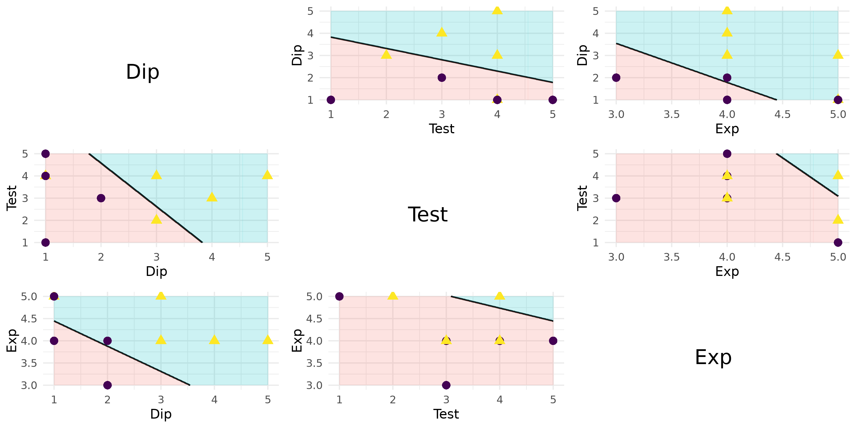
library(candisc)library(ggplot2)library(cowplot)# Predictor namespredictors <-c("Dip", "Test", "Exp")n <-length(predictors)all_plots <-list()for (i in1:n) {for (j in1:n) {if (i == j) {# Diagonal: just show variable name p <-ggplot() +annotate("text", x =0.5, y =0.5, label = predictors[i], size =6, fontface ="bold") +theme_void() # no axes, ticks, grid } else {# Off-diagonal: LDA decision region for predictor pair f <-as.formula(paste(predictors[i], "~", predictors[j])) p <-plot_discrim(lda_fit, f, resolution =400) +theme_minimal() +theme(legend.position ="none") } all_plots <-c(all_plots, list(p)) }}# Arrange all plots in an n x n matrixplot_grid(plotlist = all_plots, ncol = n)
Figure 4: A matrix of 2D scatterplots to visualise of the rule.